
Page 36 - Nazdik Brand Guidelines
P. 36
Light Mode
Color System.
NAZDIK INVESTMENT PLATFORM
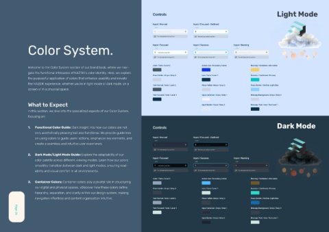
Welcome to the Color System section of our brand book, where we navi-
gate the functional intricacies of NAZDIK’s color identity. Here, we explore
the purposeful application of colors that enhance usability and elevate
the NAZDIK experience, whether you’re in light mode or dark mode, on a
screen or in a physical space.
What to Expect
In this section, we dive into the specialized aspects of our Color System,
focusing on:
Dark Mode
1. Functional Color Guide: Gain insight into how our colors are not
only aesthetically pleasing but also functional. We provide guidelines
on using colors to guide users’ actions, emphasize key elements, and
create a seamless and intuitive user experience.
2. Dark Mode/Light Mode Guide: Explore the adaptability of our
color palette across different viewing modes. Learn how our colors
smoothly transition between dark and light modes, ensuring read-
ability and visual comfort in all environments.
3. Container Colors: Container colors play a pivotal role in structuring
our digital and physical spaces. vDiscover how these colors define
hierarchy, separation, and clarity within our design system, making
navigation effortless and content organization intuitive.
Page 36