
Page 42 - Nazdik Brand Guidelines
P. 42
NAZDIK INVESTMENT PLATFORM
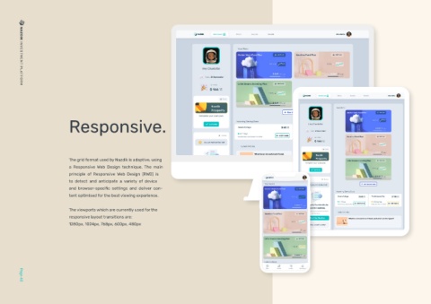
Responsive.
The grid format used by Nazdik is adaptive, using
a Responsive Web Design technique. The main
principle of Responsive Web Design (RWD) is
to detect and anticipate a variety of device
and browser-specific settings and deliver con-
tent optimised for the best viewing experience.
The viewports which are currently used for the
responsive layout transitions are:
1280px, 1024px, 768px, 600px, 480px
Page 42
